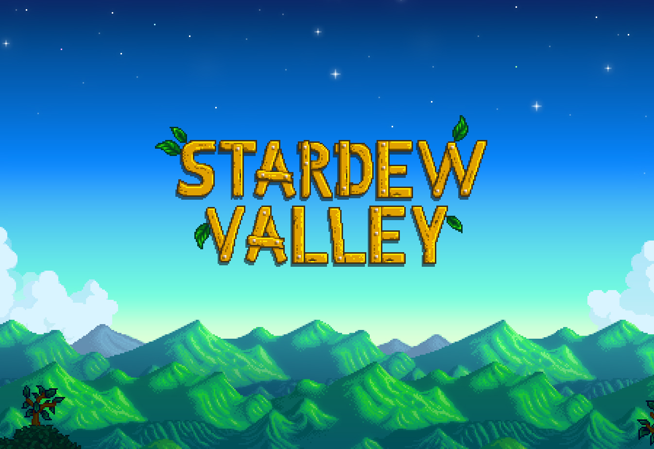
This is the start screen of Stardew Valley. It plays before the game starts, and I think it's really lovely. The first thing that really stands out is the use of value. I like that it uses a gradient to add interest to the background, as opposed to a flat color. I think it was an interesting design choice, especially considering the fact that the rest of the game remains relatively simple.
Secondly, the form here is very interesting. Whereas the rest of the game is 2d, the mountains on the bottom have a 3d effect. I think it's a little misleading, only because the rest of the game doesn't match this aesthetic. However, I think the way the mountains are designed in this shot is very lovely, and I think it's quite unique from other video games.
Finally, I love the use of line here. Even on the very tips of the mountain, there's a softness. I don't really sense any harsh edges or hard lines, which I love. I find those artistic elements have a place, but they are extremely jarring, and make artwork rather unpleasant for me. I would obviously own any of these pieces, because I have bought this game and played it extensively.
3D Printing: The New Plastic Frontier
Firstly, I really love the artist's use of space. By utilizing space, this all-white piece somehow stands out, despite the fact that it has no color. Without perfect placement of the various details in this sculpture, the whole piece may wash out and loose all its complexity.
Secondly, the use of line is quite complex and interesting. It reminds me of a sugar skull, and it twists and turns into expected places. Where the artist could have left blank, he fills in with these absolutely beautiful symmetrical designs, while still maintaining the anatomical integrity, and even incorporating a second skull into the piece.
Finally, this pieces form is fascinating. The fact that he was able to build two skulls interposed on one another is incredible, and I appreciate the mix between fact and fiction. Additionally, I think that the choice to have a 3D sculpture was crucial to the success of this piece. As a drawing, it would have lost much of it's charm and simplicity. Although it is obviously complex, it doesn't have the shading, tone changes, and other art nuances that would be required to translate it into another medium.
I am hesitant to say if I would own this piece or not, mainly because I have no clue what size it is. I really love the aesthetic appeal, but this thing could either be extremely small or extremely large, and I am not looking for those sorts of surprises.
This piece is simply called "Profile," with no specific date, by the same artist. The first thing that stands out to me here is texture. Whereas the previous piece was very flat, if you look closely at the cerebellum, or the very bottom of the jaw behind the decoration, you can see a very distinct texture. There is the appearance of bone, and brain ridges. This interest me because it's not something you would notice upon first glance, and I'm really curious about how you would program that into a printer.
Secondly, color is used very nicely in this piece.The bone is off white, the brain is pink, and the decoration is stark white. This really helps to break up the piece into two distinct parts: what is real and what is fantasy. I'm interested as to why these are the only colors used. Why not detail the blood vessels, muscle, or other integral details of human anatomy. What led the artist to choose this effect in specific.
Finally, I like the artist's use of space. There is a lot of empty space in this work, as the decorative spirals are disconnected from the skull. This leads to some interesting shadows cast, and gives the artwork a layer we wouldn't have if these parts had been connected. I would not own this piece, for the same reasons as previously stated, because space is very important to me, although I do love how it looks.
Computer Generated Influencers: Digital Manipulation
Note: Due to the nature of Instagram, I'm not able to save the two picture's I'll be discussing, the full resolution post will be linked. I was only able to screenshot the posts in question. I included the comments, because I think they really show how involved this digital influencer has become. It's not just offhand pictures, for some people, this is a living breathing experience.
This piece is untitled, created in 2020. The first thing I would like to point out is the artist's use of form. Without that, this entire image would fall flat. Look at how the sweet potatoes are perfectly misshapen and haphazardly balanced, or how her dress curves subtly at her legs and arms. This contributes an excellent sense of realism, and really sells the piece as a whole.
Secondly, tone is mastered here. Obviously, in real life there is no harsh line. People don't have black pencil outlines, telling us where they begin and end. Although this causes issues sometimes, it's critical to realistic art. Here, there isn't a single pure black outline when it comes to Miquela. She is simply herself, existing as a person would in a grocery store. Even her dress holds only subtle color shifts, and her skin transitions so naturally it's difficult to tell she's fake at first glance.
Finally, the lines are very natural in this piece. When drawing realistically, it's critical that there aren't harsh edges, and everything kind of flows into one another. This is best seen when looking at her dress, and the checkered pattern. Even that isn't rigid and straight, as the fabric moves like it would in real life. These little details really bring the piece together, and sell the image as realistic.
This piece is also untitled, published in 2020. The first thing that really stands out here is color. When doing digital art, it's really easy to stick to a couple shades of purple or blue, and use it on your entire work. However, real life doesn't operate like that. Because products come from any number of factories, no color will be the same. I notice this specifically when looking at the greens, because they're all very close together, but also distinctly different.
Secondly, tone really stands out here. Because of the perceived lighting that this "photo" was taken in, there are a lot of shadows for the animator to worry about. By slightly altering various colors, there's a depth captured by the work. Transitions are very slow into the new color, and all seem to make sense with one another. When looking at the piece, nothing is particularly out of order, or strange.
Finally, color is masterful here. One of the biggest differences between real life and digital art is that color is never quite as crisp in real life. It's impacted by shadows, by wear and tear, by lighting, and I think that's masterfully captured here. No color seems too harsh for reality, or like it's too crisp for the lighting. That requires a very delicate touch, and an in-depth understanding of how the world around us works.
I would never own this piece. I really respect the vision, and I respect the effort it takes, but I am deeply afraid of this. I learned really young about something called the uncanny valley, where something is not quite real but not quite digital, and this really captures it. It's too humanlike, but something is still slightly off. I can't put a finger on it, but both these images give me the absolute creeps.
Citations
Dodgson, Lindsay. “13 Computer-Generated Influencers You Should Be Following on Instagram.” Insider, Insider, 20 Sept. 2019, www.insider.com/cgi-influencers-you-should-be-following-instagram-2019-9.
Gever, Eyal. “Technology and Art: Engineering the Future.” BBC News, BBC, 4 Oct. 2012, www.bbc.com/news/entertainment-arts-19576763.
Joshua Harker, www.joshharker.com/.
Kljaich, Lisa. “Post Modern Influences.” Art 200x, 24 Apr. 2009, art200.community.uaf.edu/2009/04/24/02-influences-6/.
“Lil Miquela.” Wikipedia, Wikimedia Foundation, 10 Nov. 2020, en.wikipedia.org/wiki/Lil_Miquela.
“Miquela.” Instagram, www.instagram.com/lilmiquela/.
“The SideQuest March 10, 2016: Stardew Valley, Hitman, Fire Emblem Fates and E3.” SideQuesting, 13 Mar. 2016, www.sidequesting.com/2016/03/the-sidequest-march-10-2016-stardew-valley-hitman-fire-emblem-fates-and-e3/.
Turney, Alexandria. “How Eric Barone Single-Handedly Made One Of The Most Beloved Games.” ScreenRant, 1 Sept. 2020, screenrant.com/stardew-valley-update-development-eric-barone-harvest-moon/.
“Video Game Review: Stardew Valley.” Aav.works, 13 Apr. 2020, aavillagomez.wordpress.com/2016/06/07/video-game-review-stardew-valley/.
“What Is 3D Printing? How Does a 3D Printer Work? Learn 3D Printing.” 3D Printing, 17 Nov. 2020, 3dprinting.com/what-is-3d-printing/.


June,
ReplyDeleteI have to say, your blog entry is the most interesting I've read for this assignment by far. I take it that you're a gaming nerd? ;-) My boyfriend is too! I really like how you tied in today's technological advances with the Post Modern era influences. My favorite piece that you included is Profile by Joshua Harker. I like the use of soft, subtle colors to distinct, like you said, what is real and what is fantasy. The swirling, decorative lines used to form the skull and its brain are my favorite part about this piece. I feel like they romanticize something so simple and so not romantic, but its done effortlessly. Thank you for an interesting and new read.