Post Impressionism VS Art Nouveau
Post Impressionism
Post-Impressionism focused on a more stable line work then impressionism, and was heavily subject to artistic impression. Importantly, color was used to invoke certain feelings from the audience, and spark emotions. Essentially, the representation of the subject matter was clear, but the colors used took on a surreal feeling, that was subject to artistic whim.
I'm not a big fan of this art style. I find it very jarring to look at, and dislike the strange combinations of color, when applied to the realistic subject matter. I also find it very difficult to connect with what the artist intended, because I don't have a good grasp on colors and what emotions they're intended to provoke. Because of how I process stimulus, these paintings make little sense to me and just seem unattractive. This use of color to grant a glimpse into the artists perspective falls short on me, so I don't particularly enjoy it, although I do have an appreciation for the historical change this idea caused within the art world.
The three elements that throw me off within post-impressionism is the use of color, use of shades, and use of texture. For these artists, color expressed their emotion, shades helped blend the piece into cohesiveness, and the textural experience was limited.
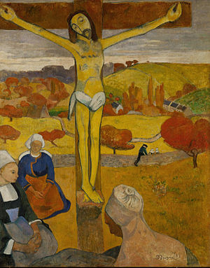
The Yellow Christ by Paul Gaugin in 1889, painted in Pont-Aven, which is a commune in France. This was painted as a post-impressionistic piece of the crucifixion. Historically the context is clear, as it represents a moment of biblical, religious importance.
The first unsettling moment of this painting is the artist's use of color. For me, yellow generally represents happiness, but I can not foresee a moment of tragedy being happy, although I know the crucifixion led to moments of religious importance.
Secondly, the artists use of shade seems very strange. Many colors (such as the cross, Jesus, and the background) are all different shades of the same color. With no clear lines differentiating the subject matter, and such equal tone, I find it hard to separate the elements that make up the piece without significant headache.
Finally, texture is a strange element in this painting. The texture is very vague, such as wood grain in the cross. The way the texture is portrayed makes it appear as though it was a child's doodle, made with a crayon, and not particularly thought out.
This painting does perfectly fulfill the post-impressionist goal of abstraction and expression of artistic interpretation via use of color, but I don't enjoy it. I find it difficult to process and can't draw the artist's intention just by viewing the piece.

Art Nouveau
This art style was meant to be a unified art style, using organic lines, inspiration from Rococo art and Japanese/Celtic styles. Philosophically, this style was meant to make cheap things that everyone had to interact with beautiful and enjoyable. The father of this philosophical ideal, William Morris, found that low-quality items pawned off on the poor abhorrent, and wanted them to indulge in luxury despite their position in society.
The three artistic elements I will focus on here is the use of line, use of color, and use of shade. For these artists, line was continuous and organic, color was meant to enrich the experience, and shade contributed to textural experiences, and limited distraction from the main attraction.
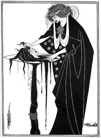
The Dancer's Reward by Aubrey Beardsley, painted in 1894. I would guess this was painted in Paris, as this is around the time where Beardsley traveled to Paris. It is a dramatic interpretation of a biblical scene, where St. John the Baptist is beheaded.
The first artistic element is use of line. Throughout this piece, lines are very organic, as is customary in this style. They are long, flowing, and come to a natural conclusion. Consider willow trees, the pattern of bark, wings etc. These all contain very natural, rounded lines that draw the eye in, much as this piece does.
The next element I want to focus on is color. Color is very simple here, as it only involves the use of black and white. This leads the viewer to really focus on the details, and makes the details clearer, because there isn't a large amount of color distracting from the focus.
This bleeds into the artists use of shade. By neglecting to use shades in this piece, the artist avoids distraction. The cut and dry quality of this piece allows it to be broken down with ease, even if somebody is not an expert in arts. It's simple to pick up on the slight smirk on the murders face, the blended together nature of hair and blood, and the detailed hair. All of these qualities may lend a recognizable quality: if somebody is familiar with the bible, the lack of shade and emphasis on detail may allow the viewer to determine what biblical/literary scene is being presented, without distraction muddying the image.
Overall, I am in love with this piece. I think it's very simple, and carries a lot of weight. It also embodies the Art Nouveau style, with its organic lines and accessibility for the common man. there is no education or prior knowledge, beyond biblical, required to understand this piece. It makes art, a previous luxury, something any layman can appreciate.

This piece is called Reclining Woman With Green Stockings, painted in 1917 by Egon Schiele. My best guess is that this was painted in Austria, as he was an Austrian born artist. This piece was created as a continuation of the artist's fixation on the female form, which consumed most of his later artwork.
Line is used masterfully here. It's continuous, smooth, and has no jagged or harsh qualities. The eye is easily drawn through the painting, stopping at no particular point, and drawing attention to every element that makes this piece beautiful.
Color is used to draw interest to certain areas. The only real bold color is the woman's lips, cheeks, and the green of her stockings. This draws attention to her mouth and her legs, sexualizing her in a manner. She strikes the viewer as innocent (as reflected by her childish pose) but also sensual, a contradiction in itself that causes interest.
Finally, the artist has a lovely grasp of shade. The woman's skin almost blends into the background, because they are so similar in color. They are only a few shades away from one another. This allows the viewer to focus on the sexualized elements of the piece. Additionally, by utilizing various shades within the woman's hair, stockings and dress, there is a sense of motion and texture that's encompassed, adding more visual interest to the piece.
This piece seems to add a hint of luxury to a base human interaction: sensuality and sexuality, which encompasses the purpose of Art Nouveau: to add class that is accessible. Where sexuality might generally encompass a nude woman, the attention to line and color here paints a sexual image without such exposure. This lady is classy, but also sensual, elevating an everyday experience to something more nuanced.
Summary
Overall, I am not a fan of post-impressionism. It has a childlike quality and, to me, little rhyme or reason with its use of artistic elements. Although I'm sure if I had better processing, these pieces would be appealing, as it stands, I find it overall difficult to interpret.
On the other hand, I adore the simplicity of Art Nouvea. Because its target is a lower class, it doesn't have the complications of previous art we've studied, and I find it to be very elegant while also extremely understandable.
Citations
“7 Greatest Art Nouveau Masterpieces.” 7 Greatest Art Nouveau Masterpieces - History Lists, historylists.org/art/7-greatest-art-nouveau-masterpieces.html.
“Aubrey Beardsley.” Wikipedia, Wikimedia Foundation, 27 Oct. 2020, en.wikipedia.org/wiki/Aubrey_Beardsley.
Beardsley, Aubrey. “The Dancer's Reward, 1894 - Aubrey Beardsley.” Www.wikiart.org, 1 Jan. 1894, www.wikiart.org/en/aubrey-beardsley/the-dancer-s-reward-1894.
Editorial, Artsy, and George Philip LeBourdais. “The Story Behind Art Nouveau.” Artsy, 23 Nov. 2016, www.artsy.net/article/artsy-editorial-art-nouveau.
“Pont-Aven.” Wikipedia, Wikimedia Foundation, 5 Oct. 2020, en.wikipedia.org/wiki/Pont-Aven.
“Post-Impressionism Movement Overview.” The Art Story, www.theartstory.org/movement/post-impressionism/.
Reclining Woman with Green Stockings, 1917 by Egon Schiele, www.egon-schiele.com/reclining-woman-with-green-stockings.jsp.
“Sunflowers (Van Gogh Series).” Wikipedia, Wikimedia Foundation, 15 Oct. 2020, en.wikipedia.org/wiki/Sunflowers_(Van_Gogh_series).
“Sunflowers - Vincent Van Gogh.” Van Gogh Museum, www.vangoghmuseum.nl/en/collection/s0031V1962.
“The Yellow Christ.” Wikipedia, Wikimedia Foundation, 19 June 2020, en.wikipedia.org/wiki/The_Yellow_Christ.


Hey June,
ReplyDeleteI appreciate your blog on these two forms of art. I found your explanation and/or appreciation for the pieces well thought. I agree with you on both styles, if I had to choose between the two I would prefer the pieces from art nouveau compared to the post impressionist pieces. The yellow was much too much in both works. And oddly enough, they lady who does my tattoo's shop is Tattoo Nouveau so I think I'm a little biased. Thanks for sharing!
CC
I agree that Art Nouveau is overall more appealing and simple. I like the themes of sensuality and sexuality, and the focus on the female form. It is interesting that artists used bold colors to draw viewers into certain parts of the paintings. I really appreciated the perspective on adding class to accessibility, and making relatable for everyone. I think that's the right direction to go in! I love the Schiele painting you chose, it's cool how the lines are so smooth and ongoing, but have blurred qualities when you look at them close. He is a really interesting artist with a unique perception of form and color. He's one of my favorites, you should look at his series of self portraits as they show his versatility and emotion.
ReplyDeletechttps://www.metmuseum.org/art/collection/search/483438